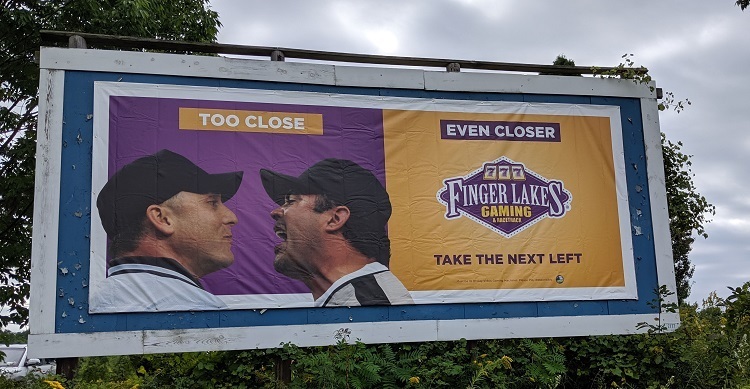
If you have decided to create a custom banner for your next advertising campaign, you need to determine your marketing goal. This will impact the design and the size of your banner. Once you know why you want to design banners for your campaign, your chances of reaching out to the targeted audience become more successful.
Table of Contents
Create the right custom banners to grab the attention
Several companies will print custom banners for you, but the best ones will always have a team of professionals who have proven track records in churning out winning designs. You should bank on them for your banner advertising needs. Check their company sites and portfolio to get an idea of how an eye-catching custom banner will work wonders for your campaign.
Choose the right size and style
When creating the right custom banners for your upcoming advertising campaign, you should choose a format and banner style that suits your environment the best. The following are some common elements for you to take into consideration when it comes to banner advertising and design-
- Setting up the banner –Do you intend to hand your banner, anchor it firmly on the ground or allow it to fly on a pole. If you are using a flag or hanging banners, they are generally raised high above the ground, and they should have fonts that are readable for strong visibility. If you are using banner stands, they are generally at eye levels in places where people can stop by and read them.
- The banner size –You should keep the banner’s location always in mind before they are placed. You need to consider how far away the average person would be when reading the sign. Their sizes commonly range from 2’x4′ to 5’x30′. However, most companies that print banners allow their customers to choose the size dimensions for their custom banners. They need to be in the range acceptable.
- Orientation of the banner –You need to decide on the orientation of the banner. Should you place the text horizontally or vertically? For most individuals, reading from the left side to the right is much easier for the eye. If you are arranging the copy of the banner in another way, make sure to use lesser words and ensure there is more space between every text line for improved clarity.
Here you should take inspiration from your environment for the research of banner designs. Take note of the banners that stand out and the others that you find less attractive or appealing. Then, learn from their mistakes and use them to refine your banner design for upcoming marketing and advertising campaigns.
When it comes to the fonts of the banner, ensure you choose them wisely. If the typography is terrible, it will ruin the overall appeal of your banner. Instead, ensure you choose a bold font and has heavy lines, as this makes it simpler for people to read your banner from a distance comfortably. For instance, you can use Sans Serif fonts as they have a minimal clean look. Also, ensure the fonts used in all your advertising banners in the future are the same to maintain consistency.
Learn more about the effectiveness of banners and other promotional content, on this website: www.landroidapps.com

